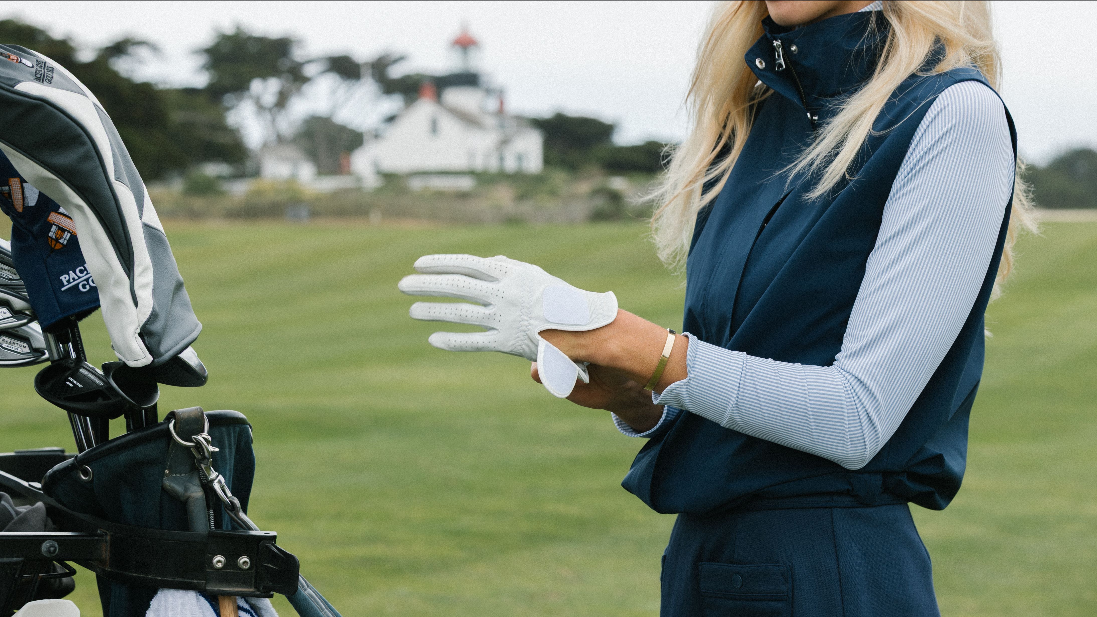
Before Team USA takes on Team Europe in Amsterdam, we have an important question to settle...who's winning the style battle?
Though the Solheim Cup is obviously about the golf, we'd be lying if we said we weren't paying attention to the outfits, too. And this year, B. Draddy gave Team USA a wardrobe that is very, very easy to get behind.
I'll be the first to admit, it's been quite some time since I've been wowed—let alone genuinely impressed—by a Solheim Cup uniform, but this feels like a great first step toward better kitting for these athletes.
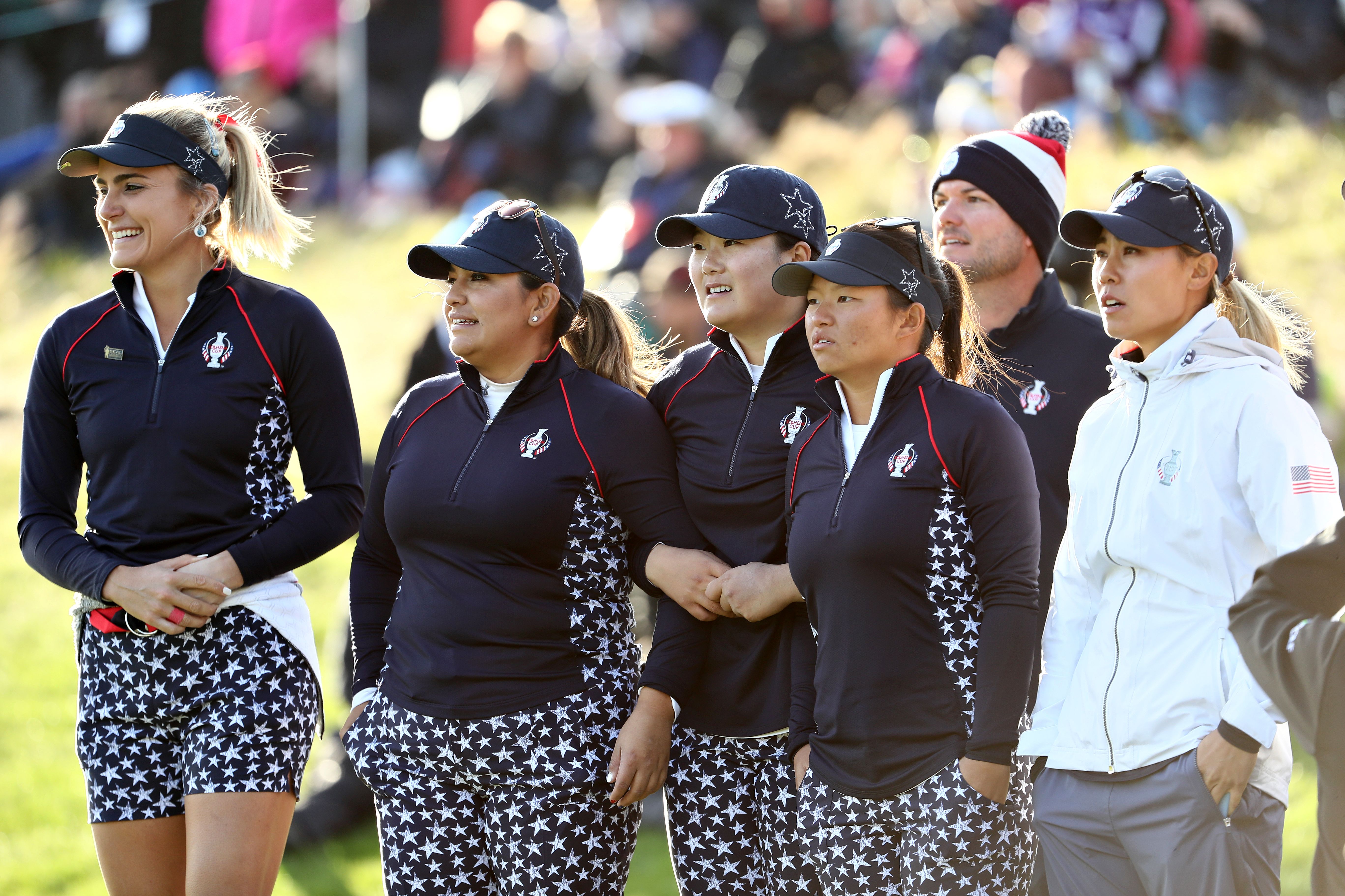
Since the early 2000s, the wardrobes on both sides of the Atlantic have felt stuck in the performance-wear rut. Uninspired polos, overly technical fabrics, questionable fits and, somehow, way too many stars.
The uniforms have often felt like an afterthought, which is a real shame for women's golf's biggest stage, where everything should feel cohesive, and players should look their best representing their nations.
Which is why I admire what B. Draddy did so much this time around.
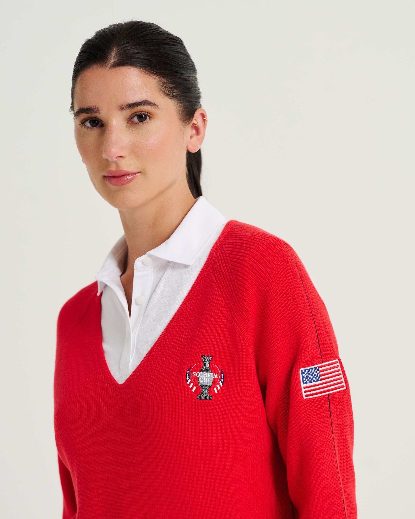
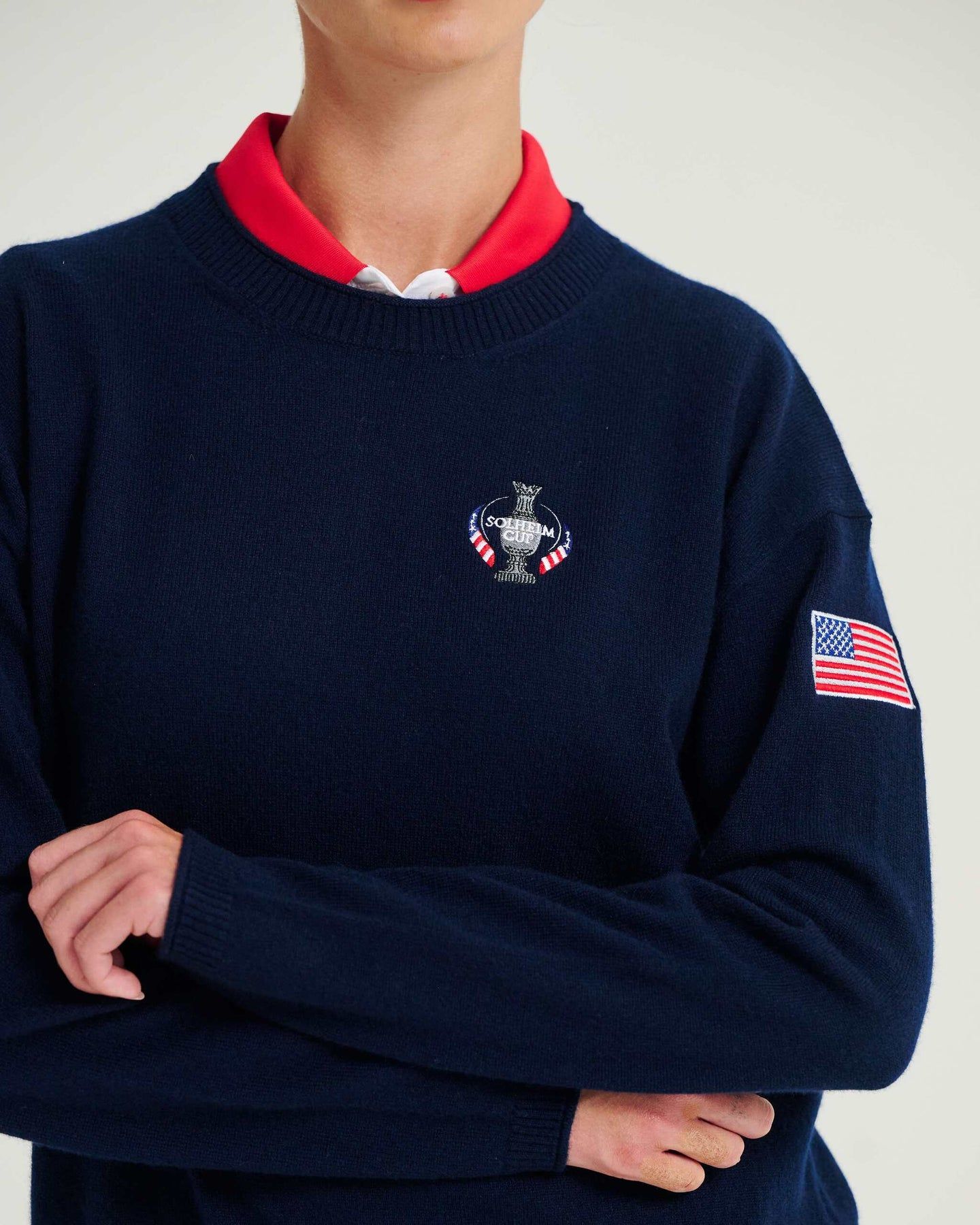
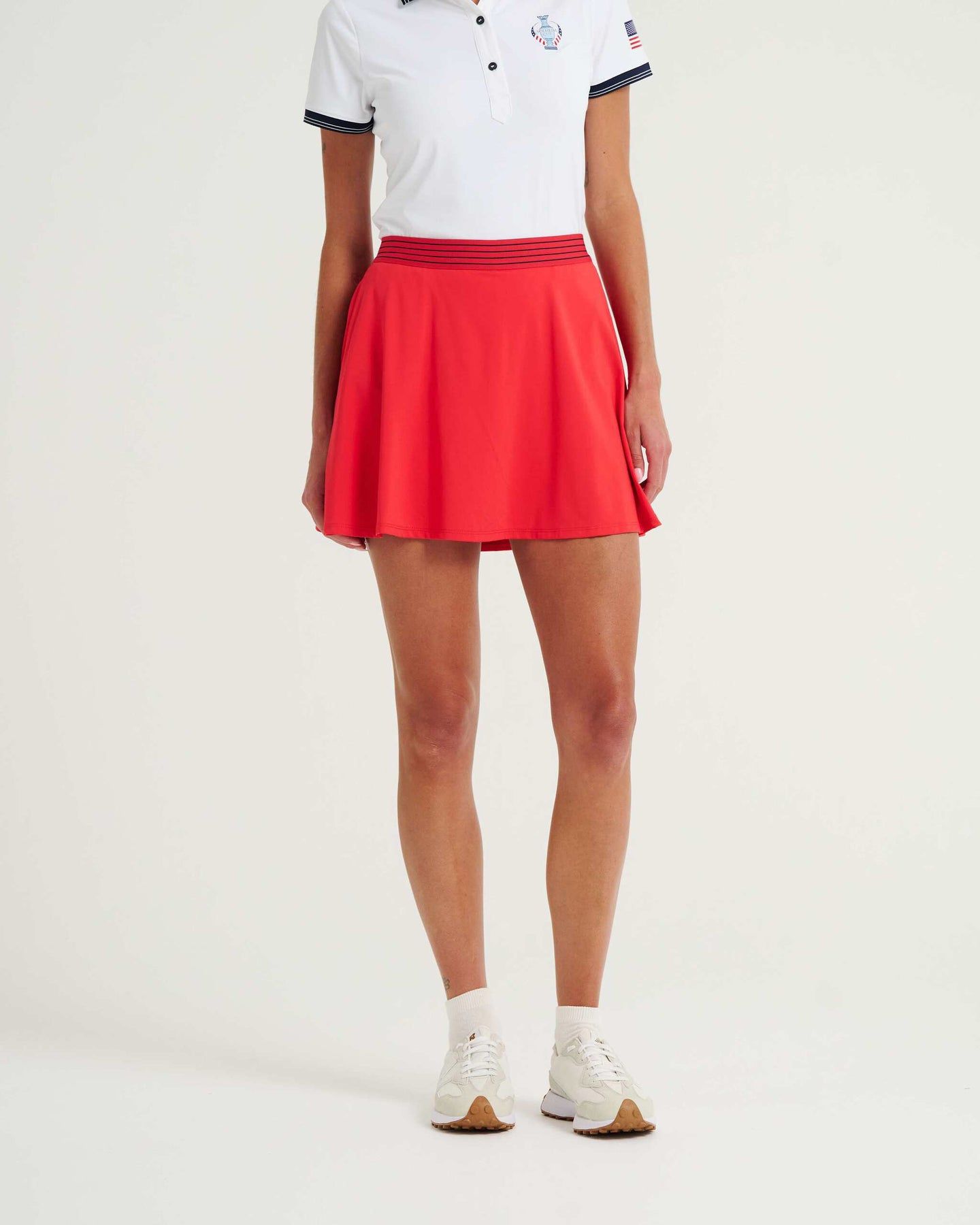
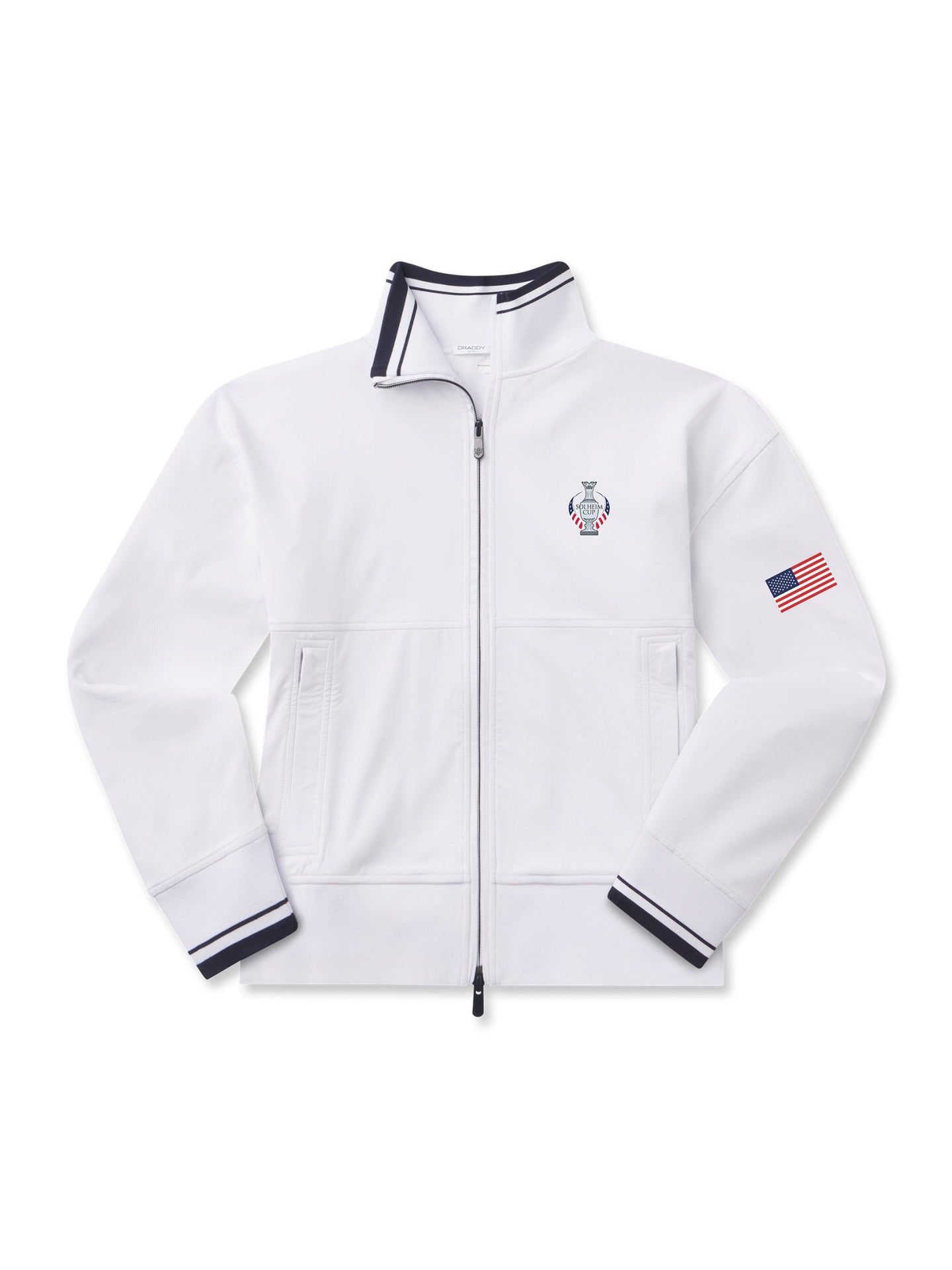
The brand didn't try to become something it isn't. Instead, it leaned into its own design ethos, creating a refined, balanced capsule of classic staples with just enough performance built in. The pieces are tailored without feeling stuffy, relaxed without looking sloppy, and perhaps, most importantly, they don't scream golf uniform.
And then there are the details. The small Solheim Cup emblem on the chest. The simple American flag perched onto the left shoulder. The understated USA lettering on the pants. None of it feels overworked or like the designers were trying to remind you every five seconds that these are Team USA uniforms. It’s clean. It’s considered. And it feels timeless, which is exactly what I want from a Solheim Cup wardrobe.
These uniforms feel so refreshing to me because I think they deliver on a lot of the things I had asked for in my
Solheim style wishlist.
I wanted throwbacks, but not just nostalgia for nostalgia's sake. Give fans something to discover, make the references subtle and make the uniforms feel connected to the history of the event without simply recycling what came before.
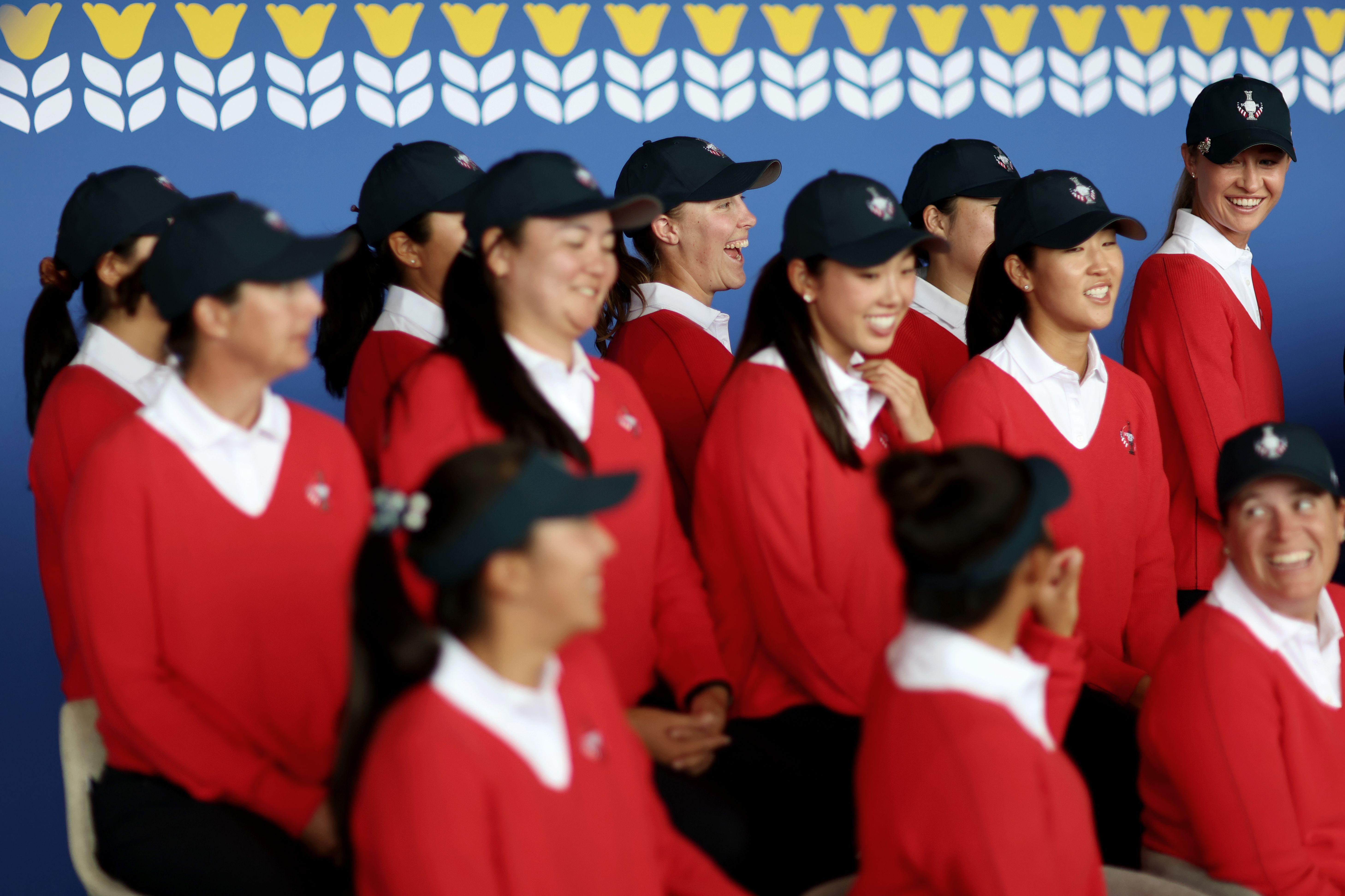
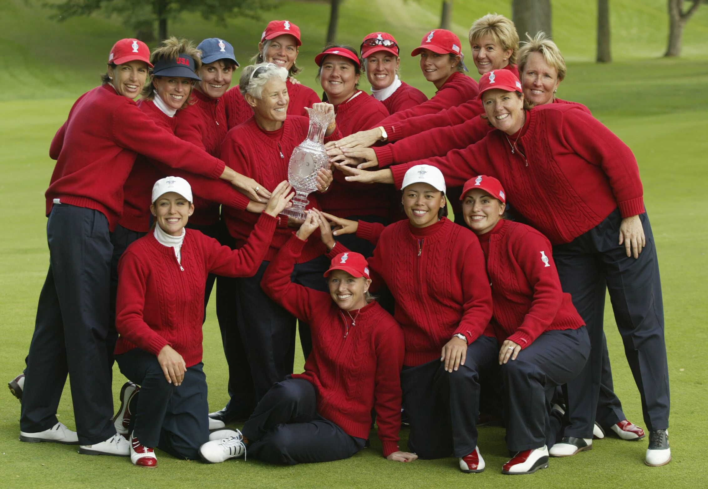
The red sweater is a perfect example. Looking back at old Team USA uniforms, the 2002 Solheim Cup at Interlachen is one of the last collections I remember seeing in pictures with a true red statement piece. And I love seeing that idea make its way back into the mix here. With Europe also leaning heavily into blue and white, a strong hit of red gives Team USA an identity that is unmistakably American without having to cover every inch of a polo in stars and stripes.
Nelly Korda of Team USA looks on during the official team photos prior to the Solheim Cup 2026 at Bernardus Golf on September 08, 2026 in Cromvoirt, Netherlands. (Photo by Naomi Baker/Getty Images)
USA team members pose with captain Patty Sheehan after the USA squad won the 2002 Solheim Cup matches between USA and Europe held at the Interlachen Golf Club on September 22, 2002 in Edina, Minnesota. (Photo By Scott Halleran/Getty Images)
That's the kind of detail I was hoping for when I wrote about giving fans something to discover. Not a costume, just a thoughtful nod to where this event and this team has been.
I wanted some personality, too. Though I'll admit, these uniforms aren't necessarily the biggest swing we've ever seen, but honestly, I don't think they need to be (that's where footwear can really play the part.) These pieces feel current without chasing a trend, classic without feeling dated and, most importantly, like something the players might actually want to wear. That's a pretty good place to start.
There is still plenty of room for women's golf to get more creative with silhouettes, fabrics, accessories and the ways we think about team uniforms. I still want to see someone, someday really go for it, but this feels like a meaningful step in the direction away from the polyester faux pas we were seeing.